


.png?height=200&name=Blog%20Posts%20Pictures%20resizing%20(1).png)
Canadian taxpayers can decrease their tax obligations by claiming business expenses when they file....
When it comes to picking the perfect colour for your office you want to make sure you’re picking something fresh and appealing, that represents your company and the feelings you want customers or employees to have about the company. Some take the simple route with white or gray, while others try to make the room ‘pop’ with a brighter shade from their logo, but studies have shown that colours are incredibly influential on our decisions, memories, and personal opinions. When it comes to an office, you want to make a good first impression on potential clients, and having an impressionable workspace can really help get your foot in the door. The right paint can mean the difference between a bright professional environment and a dark depressing workspace.
When choosing the right colours there is a lot to consider, so let us guide you through the basics of colour theory, colour matching, and what is trending right now so you can feel confident with the paint you decide on.
Basic Colour Theory

Colours exist on a continuous spectrum due to light and the way our eyes function but when it comes to using colours to design or paint, the colour wheel was created to make it an organized and easily digestible endeavour. This allows us to see at a glance which colours are primary, secondary, and tertiary as well as which are complementary (shown as direct opposites on the wheel), analogous (adjacent on the wheel), and triadic (three colours that are equally far apart, for example in the image provided, the red, yellow, and blue squares labelled ‘primary’ would all be considered triadic). Each of these relationships can produce pleasing colour combos and unlock even more beautiful matches based on their position on the wheel.
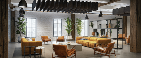
These colour relationships can also help you find the perfect compliments for your existing furniture or accents. For example, you will notice there are no shades of brown on the wheel above, that is because when you mix complementary colours you get brown. By working backwards from the tones in your wooden pieces you can find good choices for the room around you.
TIP: The easiest way to find colours that look good with brown is by using your image editing software! Take a picture of the brown item you currently have and open the picture in the editor. Use the eyedropper tool to copy the colour brown you have (it’s okay if it’s not exact) and open up your colour options menu. You should see a bar of the colour spectrum with an arrow or dot indicating where on the spectrum your brown appears, the colours closest are the shades that should look best with your brown.
Colour Matching
Trying to get colours to work together can be a huge pain, especially when working with bright bold shades, but now that we know the basics of the colour wheel we can get started on finding the perfect colour combos to complement the office by considering what it means when two colours match.
Colour harmony is the answer and must be achieved in order to find balance.
It sounds like some yoga practice mantra, but it’s true. Due to how our brains work, we instinctually want a pleasing and balanced or harmonious visual experience, so when something is not pleasing we think it is either boring or chaotic. The human brain will reject under-stimulating information but it will also reject over-stimulating information. The brain wants a logical structure that’s interesting while also providing a sense of order.
To make it even more difficult, everyone perceives colours differently, especially when held against different backgrounds or shapes. A thin strip of white might take on a slightly pink tone against a bright red background if it’s too thin, or a grouping of different colours might look terrible together but work really well when separated by white space.
The best way to achieve colour harmony? Stick to large shapes and fewer colours unless otherwise advised by a professional designer. It’s much easier to match one colour to a room than it is to match multiple colours.
TIP: Unsure of how your furniture will look with the colours you are considering for the walls? Use your samples! Most manufacturers and furniture sellers offer samples of different products so you can see the exact colours in person. These can also be used against paint swatches to compare how one will look against the other.
What’s Trending?
After all that science, let’s take a look at what’s new and fabulous! Too much of anything is not good for the office, you need a healthy balance of serious to fun, so let’s take a look at the colours everyone is loving right now.
The recent appearing colour trends are grounded in natural elements such as the sky, earth, water and plant life. Expect to see both bold colours and muted shades utilized to create different emotions, depending on how they are deployed in the space.
The colours currently having a moment include shades of:
- Blue (especially darker tones of navy)
- Muted Pinks
- Muted Greens
- Forest Green
- Rusts
- Orange
- Champagne
Jewel tones are also making a comeback alongside walls with black surfacing.
Don’t like anything listed here? You can never go wrong with a simple white wall, just make sure you have proper lighting and furniture to go against it. An empty space with white walls can feel unfinished, so take advantage of more colourful furniture pieces and woodgrains materials to give the room a grounded yet natural feel.
Looking for the Perfect Combination?
Sometimes finding the perfect colour pairing can be a nightmare, let us take the brush with our free-to-download list of colour combinations you are going to LOVE!
Download Free
“Our List of Colour Combos you will LOVE”